
Good steampunk poster art should do more than show a few gears. Look first for a clear mood, a theme that fits the room, and colors that make sense with your furniture and lighting. If the poster looks exciting online but feels too dark, too busy, or too theatrical for the wall you have in mind, it probably is not the right choice.
What makes poster art steampunk
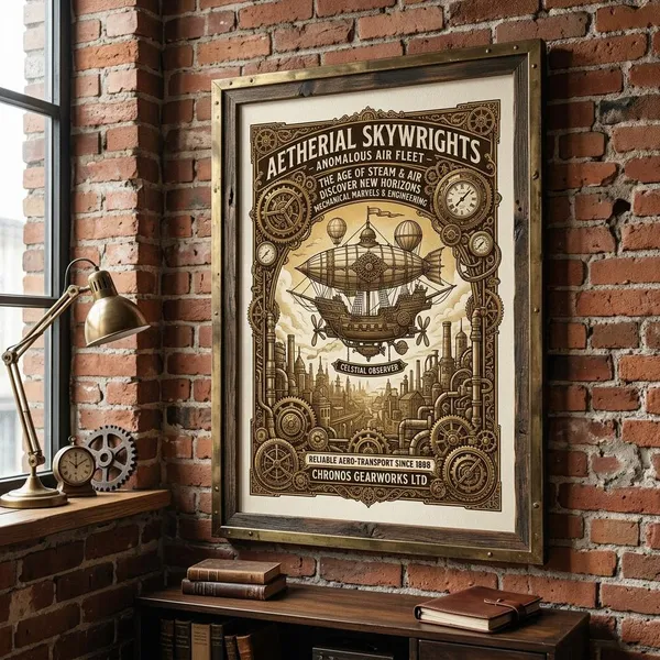
Steampunk poster art usually blends Victorian-era style with imaginary mechanical invention. The strongest designs feel like they belong to an alternate past: polished boots, brass machines, smoke, rivets, old lettering, and technology that looks hand-built rather than digital.
Victorian-inspired settings and characters
Victorian details give steampunk its historical pull. Tailored coats, corsets, waistcoats, goggles, top hats, pocket watches, lace, gaslit streets, train stations, libraries, and old laboratories all help place the artwork in a believable world.
Imagined steam-powered technology
The technology does not have to be realistic, but it should look mechanically convincing. Pipes, gauges, valves, boilers, rivets, pressure dials, and exposed parts make a fictional machine feel as if someone could almost build it.
- Good fit: workshops, offices, hobby rooms, and creative spaces.
- Use carefully: bedrooms or calm rooms, where heavy machinery can feel visually loud.
- Common mistake: choosing a poster with machinery so crowded that nothing stands out from a few feet away.
Gears clocks airships and locomotives
Gears, clocks, airships, and locomotives are classic steampunk symbols because they connect time, travel, invention, and old industrial design. They work best when they support the subject rather than sit on top of it as decoration.
Brass copper and aged metal tones
Brass, copper, bronze, iron, and tarnished metal tones create the warm industrial look most people associate with steampunk. They pair naturally with dark wood, leather, tan walls, black accents, old books, and vintage lighting.
If your room is pale, minimal, or mostly cool gray, choose a poster with cleaner contrast rather than heavy brown-on-brown tones. Otherwise the artwork may look muddy instead of rich.
Vintage typography and weathered textures
Old travel lettering, patent-style labels, railway fonts, faded paper, smoke marks, worn edges, and sepia staining can make a poster feel more authentic. This is a good route if you want steampunk atmosphere without a full fantasy scene.
Popular steampunk poster themes
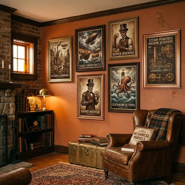
The theme decides the room's mood more than any single detail. Airships feel adventurous, laboratories feel inventive, portraits feel intimate, and retro travel posters feel decorative and easier to blend with everyday interiors.
Before choosing a design, decide whether the poster should quietly support the room or become the thing people notice first. That one choice prevents many mismatches.
Airship travel and exploration
Airship posters are a safe entry point into steampunk because they feel adventurous without becoming too dark or niche. A dirigible over clouds, mountains, or a Victorian skyline adds lift to a room and works well when you want imagination rather than gloom.
Inventors and mechanical laboratories
Laboratory posters are for rooms where detail is a benefit. Workbenches, blueprints, engines, bottles, tools, and experimental machines reward close viewing, so they make sense above a desk, beside a model-making area, or in a creative studio.
They are less ideal for a wall viewed mainly from a doorway. If the composition is very dark or packed with tiny objects, the poster can lose its charm at a distance.
Clockwork cities and machines
Clockwork city art gives a wall scale and drama. Pipes, towers, bridges, smokestacks, rails, and giant cogs can turn a plain living room wall or stairwell into a strong focal point.
- Choose detailed city art for nearby viewing or large prints.
- Choose simpler skylines for rooms where people see the poster from across the space.
- Avoid very low contrast if the room has dim lighting.
Victorian fashion and character portraits
Portraits bring emotion and attitude. A single figure in Victorian-inspired clothing can make a bedroom, dressing area, reading nook, or studio feel more curated than a machine-heavy poster would.
Retro travel and propaganda posters
Retro travel and propaganda-style posters are often the easiest to decorate with. They use bold shapes, limited colors, vintage fonts, and fictional destinations or inventions, so they feel graphic rather than overly detailed.
Mechanical animals and fantasy creatures
Mechanical owls, brass insects, clockwork foxes, armored birds, and other hybrid creatures bring out the playful side of steampunk. One strong creature print can add personality without turning the whole room into a theme.
This is a good choice for teen bedrooms, game rooms, libraries, or eclectic spaces. Keep nearby decor calmer if the creature itself is already highly detailed.
How to choose a steampunk poster
Start with the wall, not the artwork. The best poster is the one that fits the room's size, light, mood, and viewing distance. A dramatic print can look impressive online and still feel wrong if it fights the furniture or disappears in a dark corner.
Match the theme to the room
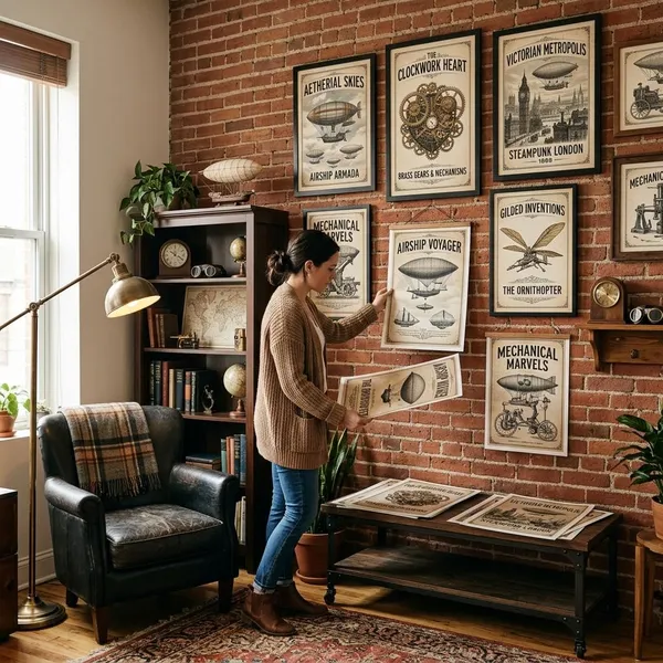
A poster feels more natural when its subject matches what happens in the room. Airships and travel scenes suit hallways, offices, and living rooms because they feel open and easy to read. Laboratories, diagrams, and clockwork machines make more sense in studies, workshops, or hobby spaces.
Choose colors that suit the decor
Most steampunk posters sit in warm territory: brass, copper, sepia, cream, charcoal, deep brown, burgundy, and muted teal. Match at least one of those tones to something already in the room, such as a lamp, shelf, rug, frame, chair, or cushion.
Dark posters need enough light to show their details. If the wall is in a dim corner, look for cream backgrounds, brighter highlights, or a clear central subject instead of a low-contrast bronze scene.
Select the right size and orientation
Size mistakes are easy to make with poster art. A small print over a wide sofa can look accidental, while an oversized vertical poster in a narrow corner can feel cramped.
- Vertical: narrow walls, beside shelves, between windows.
- Horizontal: above sofas, beds, consoles, and long desks.
- Square: gallery walls or balanced layouts.
- Before ordering: tape the dimensions on the wall and stand where you normally view the room.
Consider the viewing distance
Detailed steampunk art is most satisfying when people can see it up close. Above a desk, in a hallway, or beside a reading chair, small gears, labels, and textures become part of the pleasure.
For a wall across a living room, choose a stronger focal point: a large airship, a clear portrait silhouette, a bold city skyline, or a graphic travel layout. The poster should still make sense when someone glances at it while walking through the room.
Decide between subtle and statement art
Subtle art is better for shared rooms, rentals, and spaces where you may change furniture or colors later. Look for faded paper, restrained typography, smaller machines, and softer contrast.
How to choose the right print and frame
The print surface and frame change how polished the poster feels. Paper keeps graphic details crisp, canvas softens the image, matte finishes reduce glare, wood adds Victorian warmth, and metal gives the design a more industrial edge.
If you are unsure, choose a matte paper print in a simple frame first. It is flexible, affordable, and easier to replace later than a large custom canvas or heavy decorative frame.
Paper prints for affordable framing
Paper prints are the most practical choice for most buyers. They are affordable, easy to frame, and especially good for travel posters, typography designs, patent-style drawings, and crisp graphic layouts.
Canvas prints for a softer finish
Canvas works well for painterly portraits, moody city scenes, and atmospheric airship art. The texture makes the piece feel softer and less like a standard poster.
Skip canvas if the design depends on sharp lettering or tiny technical detail. Paper usually keeps those edges cleaner.
Matte surfaces for reduced glare
Matte is usually the safest finish for steampunk art because it cuts reflections and suits aged paper, tarnished metal, and weathered textures. It is especially useful for darker designs that would lose detail behind glare.
Gloss can add contrast, but it may also make an antique-inspired print feel too slick. Use it only if the room has controlled lighting and the artwork is meant to look bold rather than aged.
Dark wood frames for Victorian warmth
Dark wood frames suit the historical side of steampunk. Walnut, espresso, and mahogany-like finishes work beautifully with sepia prints, brass tones, portraits, maps, and vintage travel designs.
- Best for: studies, bedrooms, libraries, hallways, and traditional living rooms.
- Pair with: books, leather, warm lamps, dark shelves, and antique-inspired decor.
- Keep it simple: a plain dark frame often looks better than an overly ornate one.
Metal frames for an industrial look
Metal frames bring out the engineered side of steampunk. Black, gunmetal, bronze, or brushed metal works well with laboratory scenes, mechanical diagrams, cityscapes, and bold propaganda-style designs.
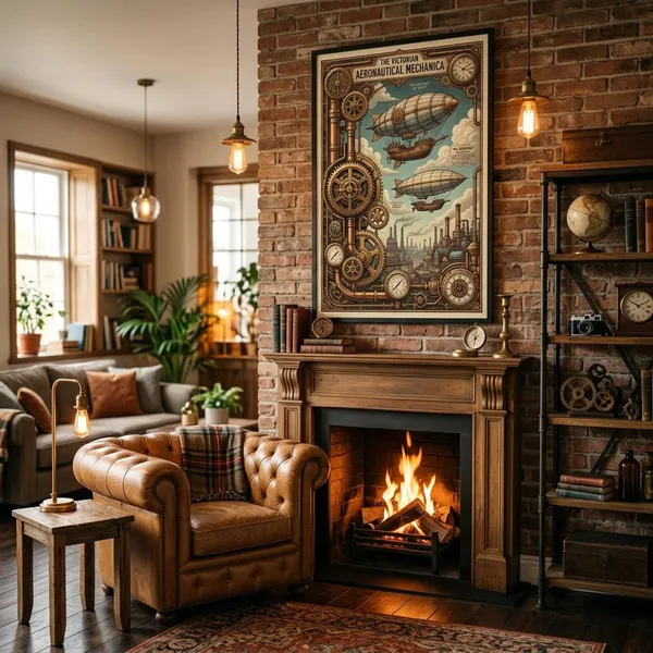
This is the better option for modern homes, loft-style rooms, concrete tones, exposed bulbs, metal shelving, or minimalist furniture. It keeps the poster feeling current instead of turning the whole space Victorian.
Conclusion
A good steampunk poster should fit the wall first and the fantasy second. Choose the mood, check the colors and viewing distance, then pick a print and frame that support the room instead of fighting it. When those basics line up, even a small poster can feel intentional rather than like a random themed decoration.
FAQ
What makes a poster look steampunk?
It looks steampunk when Victorian styling and mechanical invention appear together. Gears help, but the poster also needs the right materials, setting, typography, or retro-futuristic mood.
What colors suit steampunk poster art?
Warm metals, sepia, brown, cream, charcoal, burgundy, and muted teal usually work best. In a modern room, choose cleaner contrast so the poster does not look too heavy.
Where should you display a steampunk poster?
Display it where the theme matches the room's use. Detailed lab scenes suit desks and studios, while airships, travel prints, and cityscapes work better on larger walls seen from farther away.
How is steampunk art different from cyberpunk art?
Steampunk is antique, mechanical, and Victorian-inspired. Cyberpunk is digital, neon-lit, futuristic, and usually more urban or dystopian.
What makes a poster look steampunk?
It looks steampunk when Victorian styling and mechanical invention appear together. Gears help, but the poster also needs the right materials, setting, typography, or retro-futuristic mood.
What colors suit steampunk poster art?
Warm metals, sepia, brown, cream, charcoal, burgundy, and muted teal usually work best. In a modern room, choose cleaner contrast so the poster does not look too heavy.
Where should you display a steampunk poster?
Display it where the theme matches the room's use. Detailed lab scenes suit desks and studios, while airships, travel prints, and cityscapes work better on larger walls seen from farther away.
How is steampunk art different from cyberpunk art?
Steampunk is antique, mechanical, and Victorian-inspired. Cyberpunk is digital, neon-lit, futuristic, and usually more urban or dystopian.