
Good steampunk pixel art starts with readable machinery, not with dozens of tiny gears. Pick one clear subject, build a strong silhouette, limit the palette, and only add detail where it helps the viewer understand the metal, steam, light, or function.
Best colors for steampunk pixel art
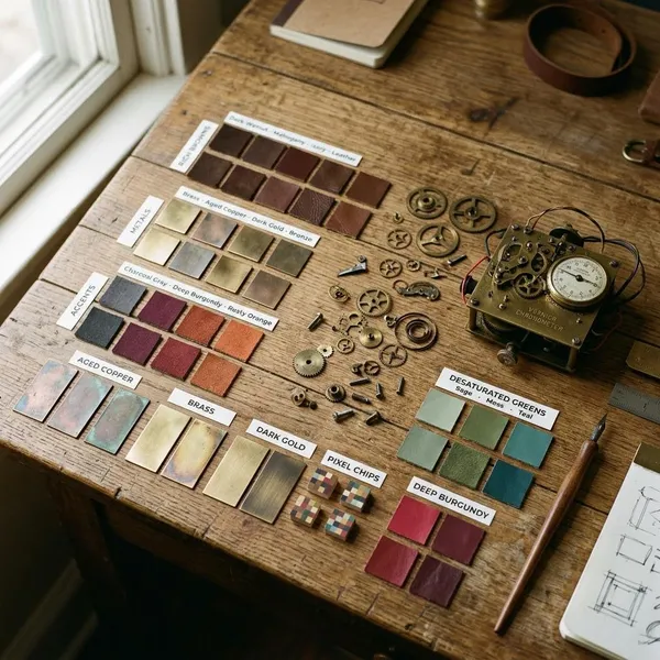
The safest palette is warm metal plus dark structure plus one controlled accent. Brass and copper create the antique machinery feel, while charcoal, iron gray, and dark brown stop everything from becoming one muddy orange shape.
If you are making a tiny sprite, choose fewer colors than you think you need. For a larger scene, you can add more wood, fabric, patina, and glow colors, but only after the main forms still read clearly at the final display size.
Brass bronze and copper
Use brass for bright trim, gauge rims, polished edges, and focal details. Bronze works better for heavier plates and older machinery, while copper is useful for pipes, coils, heat vents, and anything that should feel warm or pressure-driven.
Iron charcoal and dark brown
Iron, charcoal, and dark brown are the colors that make the warm metals readable. Use them for frames, recesses, hinges, deep gaps, outlines, and the parts that need to feel heavy rather than decorative.
- Use charcoal behind pipes, plates, and vents to separate overlaps.
- Use iron gray for pistons, braces, hinges, and mechanical supports.
- Use dark brown instead of pure black when you want a warmer, older mood.
Mahogany burgundy and muted gold
Mahogany, burgundy, and muted gold add the Victorian side of the style. They work well for polished wood, leather straps, coat fabric, upholstered seats, control panels, cabin interiors, and decorative trim.
Keep these as supporting colors unless the subject is more elegant than industrial. A burgundy scarf on a character or a mahogany handle on a weapon can add personality without stealing attention from the machinery.
Oxidized green for aged metal
Oxidized green is best used as a small weathering accent on copper or bronze. Place it near seams, rivets, pipe joints, lower edges, and damp-looking areas where patina would naturally collect.
A few green pixels can make a boiler feel old. Too many can make the surface look painted instead of metallic, so use it as evidence of age rather than as a full material color.
Amber blue or red for glowing accents
Amber is the easiest glow color for lamps, furnace windows, gauges, and portholes because it sits naturally with brass and brown. Blue feels colder and more electrical, while red is useful for alarms, danger lights, overheated engines, or hostile machines.
| Glow color | Best use | What to avoid |
|---|---|---|
| Amber | Lanterns, furnaces, gauges | Making every metal highlight orange |
| Blue | Electric coils, labs, advanced devices | Using so much blue that the piece stops feeling steampunk |
| Red | Warnings, enemies, pressure alarms | Large red areas that overpower the silhouette |
How to create steampunk pixel art
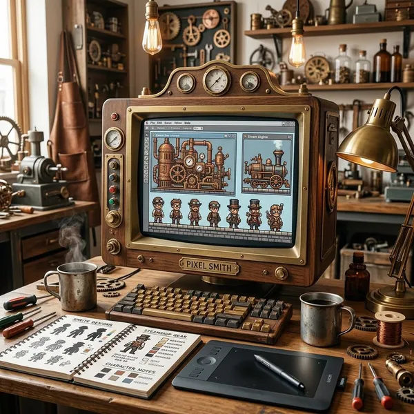
The cleanest workflow is to solve the big decisions first: subject, palette, silhouette, and major machinery. Small bolts, vents, rivets, scratches, and gear teeth should come late, after the artwork already works as a readable sprite or prop.
Choose one clear subject
Choose a subject that can be understood in one glance: a steam knight, brass drone, furnace door, walking boiler, clockwork rifle, or pipe-covered backpack. If the idea is only "something steampunk," the result usually becomes a random collection of tubes.
Pick one visual hook before drawing details. A tall chimney, glowing eye, oversized tank, piston arm, or round pressure gauge gives the viewer something to read first.
Build a limited color palette
Assign each color a job before rendering. For example, charcoal can handle recesses, bronze can carry the main body, brass can mark important edges, mahogany can cover wood or leather, and amber can be reserved for the only glow source.
- Tiny sprite: use one dark, two metal tones, one highlight, and one accent.
- Character sprite: add one fabric or leather color if it improves the design.
- Environment scene: add extra shades slowly, then test the scene zoomed out.
Block out the main silhouette
The silhouette should explain the subject before interior details appear. Block in the tank, hat brim, shoulder housing, wheel base, pipe arch, backpack boiler, or furnace shape as a solid mass first.
Add large mechanical forms
Add recognizable machinery in medium-to-large shapes: cylinders, boilers, pistons, tanks, vents, gauges, exhaust pipes, and braces. One readable piston is stronger than five tiny marks that might be gears, bolts, or noise.
Place parts where they seem to have a reason to exist. A tank should feed a pipe, a piston should connect to something that moves, and a gauge should sit where an operator or viewer could plausibly read it.
Refine the metal and lighting
Use lighting to tell the viewer what matters. Put the strongest highlight on the focal metal surface, keep overlap shadows dark, and avoid giving every plate the same shine.
On a polished pipe, a narrow bright line may be enough. On a flat iron panel, one corner highlight and one dark edge can communicate the material more clearly than soft shading across the whole surface.
Finish with steam wear and small details
Add wear only after the form is clear. Soot belongs near vents and chimneys, scratches belong on exposed edges, patina belongs around damp seams, and heat discoloration makes most sense near furnace doors or pipe exits.
- Zoom out to the final size.
- Remove details that blur the silhouette.
- Keep the details that explain function, age, or focal points.
- Leave some surfaces calm so the important machinery stands out.
How to draw readable steampunk machinery
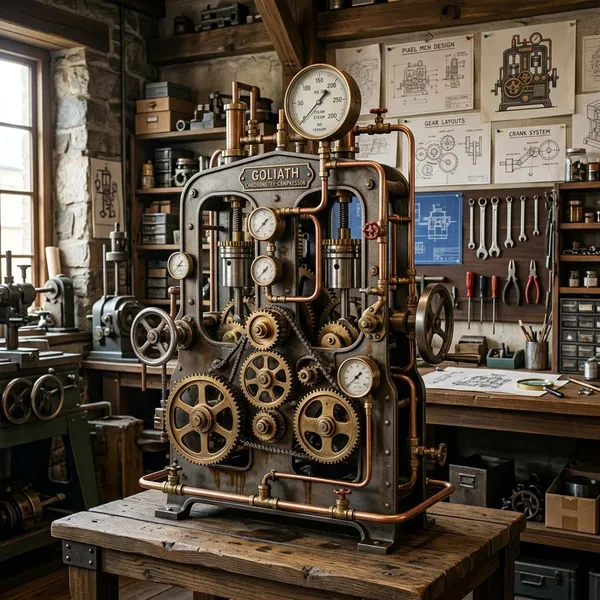
Readable machinery has hierarchy. The big outer shape tells the viewer what the object is, the medium parts explain how it might work, and the smallest marks add material, age, or personality.
Use simple geometric forms
Build machinery from circles, cylinders, rectangles, arches, boxes, and clean diagonal braces. A boiler can start as a cylinder, a furnace door as a rectangle, a gauge as a circle, and a pipe as a simple curve.
Give every moving part a function
A moving part should imply a job: pistons push, belts transfer motion, wheels rotate, vents release heat, and levers control something. Fictional machines can still feel believable when the parts appear connected.
For a small enemy sprite, a single piston attached to a weapon arm will read better than a row of decorative gears on the chest. Function gives the viewer a reason to understand the shape.
Separate overlapping parts with contrast
When a pipe crosses a tank, separate them with value, temperature, or a small shadow. Brass on bronze can disappear quickly, but brass over charcoal or warm copper over cool iron is much easier to read.
- Use a dark gap behind light pipes.
- Change material color where two parts overlap.
- Reserve outlines for the most confusing intersections.
Show metal through controlled highlights
Metal needs selective shine, not shine everywhere. Put hard highlights on exposed edges, rims, corners, and curved surfaces that face the light.
If the viewer should notice a visor, blade, pressure dome, or gauge first, give that area the cleanest highlight. Let secondary metal surfaces stay darker or more broken so the focal point remains clear.
Limit tiny gears and surface noise
Tiny gears are often the fastest way to make a steampunk sprite worse. If the teeth cannot be read clearly, simplify the gear into a circle with a few notches or replace it with a larger mechanical shape.
Surface noise has the same problem. Random rivets, scratches, vents, and panel lines flatten the design when every area competes for attention. A broad quiet boiler body can make one gauge cluster feel more important than a dozen scattered details.
How to create metal steam and light effects
Metal, steam, and light effects should support the object rather than cover it. Use hard highlights for polished metal, broken highlights for aged surfaces, rounded clusters for steam, small bright accents for lamps, and deep shadows to separate mechanical layers.
Hard highlights for polished metal
Polished brass, copper, and clean iron read well with sharp, compact highlights. A one-pixel edge hit on a pipe or a bright corner on a plate can do more than several blended shades.
Keep the highlight clearly tied to the form. Cylinders usually need a narrow band, while flat plates often need a crisp edge or corner rather than a stripe through the middle.
Broken highlights for aged surfaces
Aged metal should reflect light unevenly. Break the highlight line, dull the brightest tone slightly, or interrupt it with small dark gaps to suggest tarnish, scratches, and worn edges.
Soft clusters for steam and smoke
Steam works best as rounded clusters that are densest near the vent, valve, leak, or exhaust. As the vapor moves away, break it into smaller pieces and lower the contrast.
For a tiny sprite, one or two puffs may be enough. For a larger workshop or airship scene, use several uneven clusters so the steam feels layered rather than stamped on.
Bright accents for lamps and gauges
Lamps and gauges need a small bright center, not a huge glow cloud. Put the hottest pixel near the light source, then add one softer color on nearby metal if there is enough space.
Dark shadows for mechanical depth
Dark shadows make machinery feel layered and heavy. Place them under overhangs, behind pipes, inside vents, between plates, and anywhere one mechanical part sits in front of another.
If the sprite becomes too dark, keep the deepest shadows only at the most important overlaps. That gives depth without making the whole object hard to read.
Conclusion
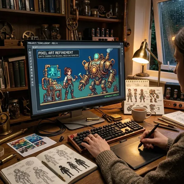
The strongest steampunk pieces usually look detailed because the details are chosen carefully, not because every empty pixel is filled. Start with a subject that reads clearly, give the machinery a believable purpose, and use color, light, steam, and wear to support that idea. If the artwork still works when zoomed out, you are on the right track.
FAQ
Which colors work best for steampunk pixel art?
Warm metals and dark structure work best: brass, bronze, copper, iron gray, charcoal, and dark brown. Add mahogany, burgundy, oxidized green, or a small amber glow only when they serve a clear material or focal point.
How much detail should a steampunk sprite include?
Include only the detail that survives at final size. A small sprite usually needs one strong silhouette, one main mechanical feature, and a few readable accents rather than many tiny gears and scratches.
What canvas size should beginners use?
Beginners can start with 32x32 for simple props, 48x48 for small characters, or 64x64 for a compact machine. If you keep adding detail that no longer reads when zoomed out, the canvas is probably larger than your current design needs.
Which colors work best for steampunk pixel art?
Warm metals and dark structure work best: brass, bronze, copper, iron gray, charcoal, and dark brown. Add mahogany, burgundy, oxidized green, or a small amber glow only when they serve a clear material or focal point.
How much detail should a steampunk sprite include?
Include only the detail that survives at final size. A small sprite usually needs one strong silhouette, one main mechanical feature, and a few readable accents rather than many tiny gears and scratches.
What canvas size should beginners use?
Beginners can start with 32x32 for simple props, 48x48 for small characters, or 64x64 for a compact machine. If you keep adding detail that no longer reads when zoomed out, the canvas is probably larger than your current design needs.